M4 / Book Design / Final

For my final design, I combined two similar sketch concepts (Sketches #4 & #6) to use as the artwork for the front and back, so that there would be a sense of continuation from cover to cover.
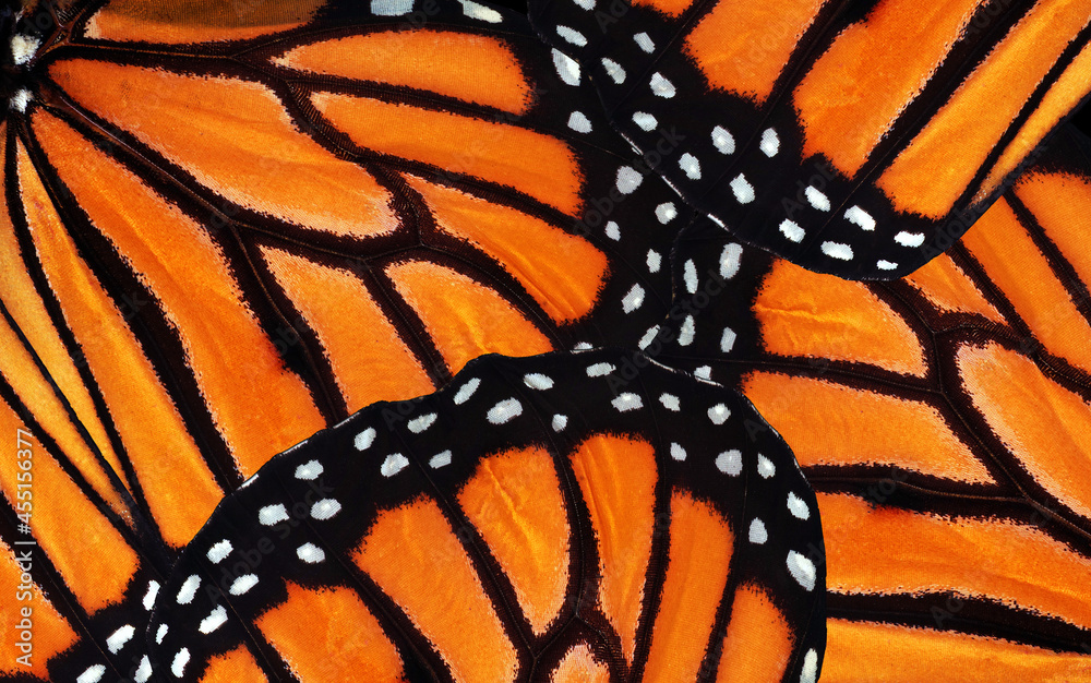
I used the Y2K cliche design of the inverted colors. I liked it for the period pastiche, and because it turned the naturalistic monarch butterfly coloration into a cyberpunk neon blue, making it look more digital. I continued the butterfly pattern for the spine. I used a monarch butterfly texture from Adobe Stock. My matrix code texture is courtesy of EnvatoTuts+. I used multiple screening layers and adjusted the second one slightly up and rightward to make a glitching effect. I wanted the edges to bleed, so I rasterized the font (I used a very simple one so that it would not be too busy), blurred the each letter with extra blurring downward on the bottoms, and then used several layers of screening the code texture. I used a gradient to make the code fade out toward the edges, and went in with a paintbrush tool for additional precision. I blurred the tops of the rectangles to make the edge blurring horizontally symmetrical.
For the back cover, I mirrored the motif of the dual rectangles for similarity and cohesion. I used a few different brushes to scratch away at the edges and give a bleeding effect. Again, I wanted the bleeding edges to be symmetrical and blur together. I struggled to find a way to make the rectangles a striking color to match the rest of the design, while also making the text visible. Ultimately I think the only way to make the test visible was to use a stroke effect around the description.
The book barcode and Penguin Books logo were both found on Wikipedia.

Comments
Post a Comment