M3 CP / Awareness Poster / Final Design(s)

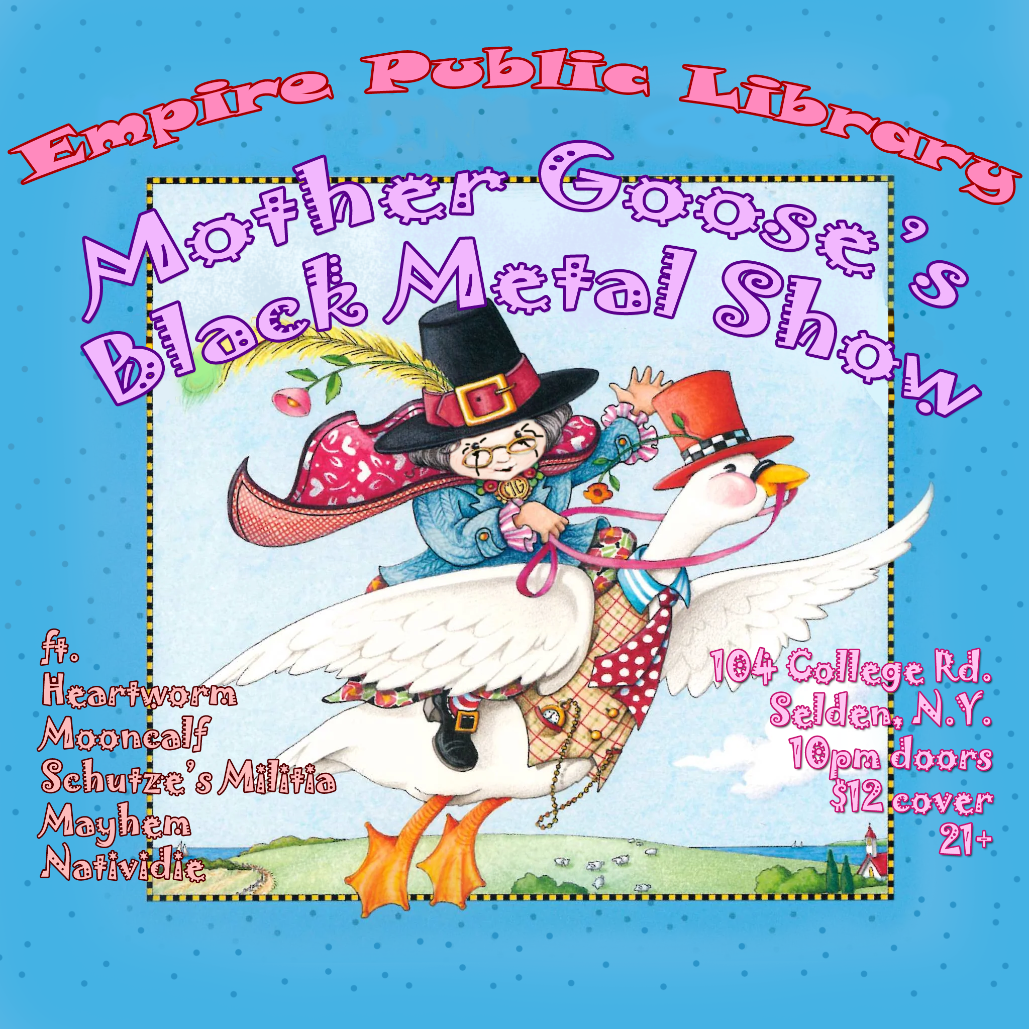
In the end, I wound up making two different versions of the same flyer, but for good reason. For this event, I imagine it being advertised both on a library bulletin board and as a flyer hung up at my local metal bar, and I felt I needed two different posters for each location, based on what would most stand out in each environment.
I maintain that the most important design element is color, and basic color theory states that to make something pop, it should have a high contrast with its surrounding colors. For the flyer wall at the metal bar, I know my poster will be surrounded by dark, aggressive or dour looking ads. I wanted to make sure it stuck out by giving it a color scheme that was the opposite of the grim, metallic or gory poster designs in its environment. The typeface is meant to look like the kinds of zany fonts used in Mary Engelbreit designs, and I matched her style of using strokes to outline the colorful fonts. I wanted with a surface layer reminiscent of a granny's knitting club invitation to catch people's eyes, because I believe it would catch people's curiosity as to what it is or how it wound up on their wall. A concern I have is that all of the different colored fonts may look messy, but I was trying to emulate her style of adding an almost dizzying amount of different colors to her book covers.
For the flyer to be placed in the library, the composition was inverted. I wanted to advertise a friendly community event with a coating of edgy design elements to imply that it was different from ordinary library fare. I used the traditional metal flyer design style of using a dark, monochrome gradient map with a pop of white text on top. I arranged the gradient map to invert the shadows and highlights, so that the white goose would look more like a huge black crow or raven, and Mother Goose's face would look more dramatic.
To get the base composition, I first used Google's image search adjusted to only show large images, I found a Mary Engelbreit character and edited black metal "corpse paint" onto the face. To remove the text with Engelbreit's name and the title, I used a mix between the generative fill and paintbrush tool.
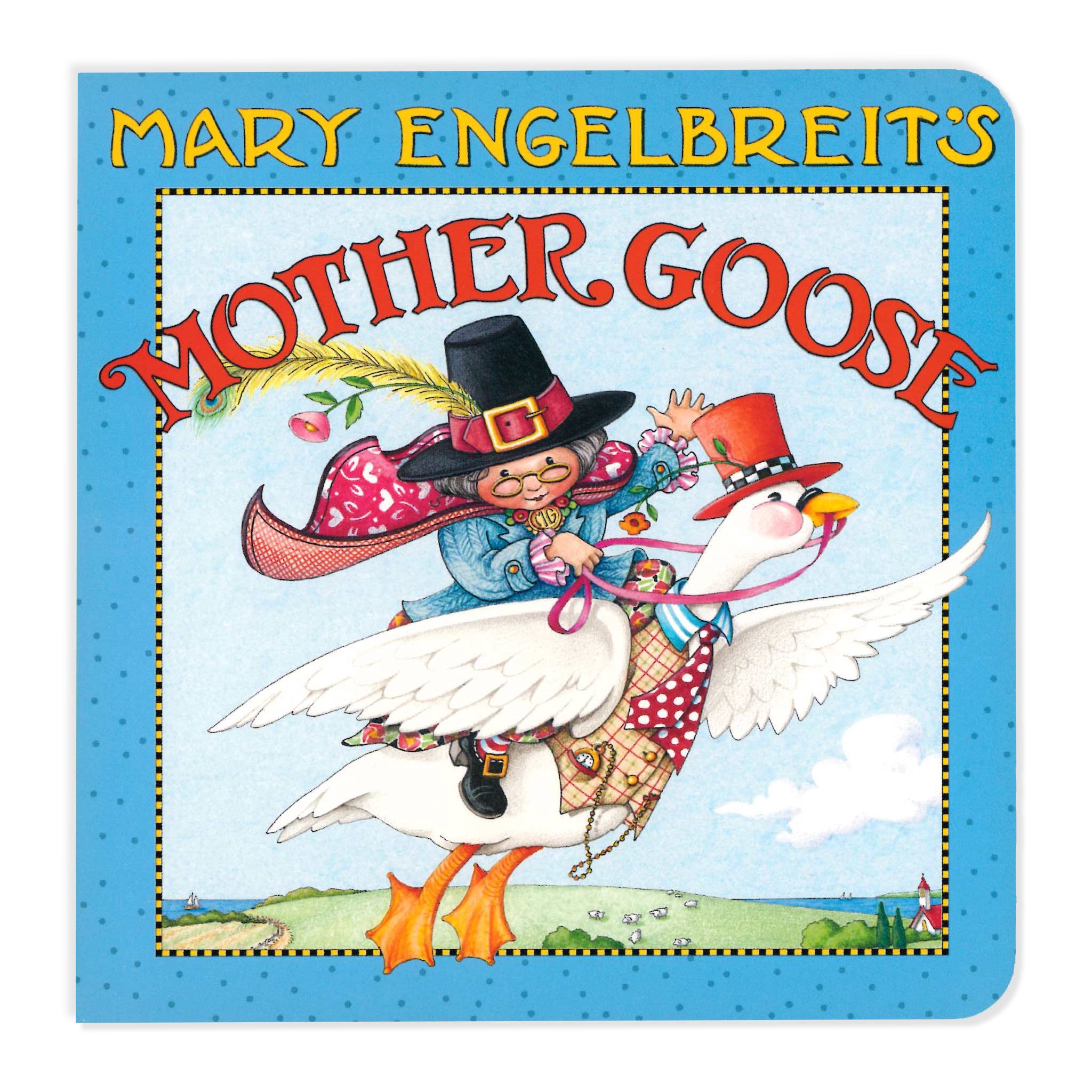
Original "Mother Goose" Book Cover by Mary Engelbreit

Comments
Post a Comment